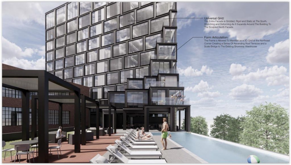
The developer of a planned residential tower overlooking Edgewater Park redesigned it based on market analysis and a need to control costs. The end result was a new design that won more praise and support from the Cleveland Landmarks Commission. This view looks southeast from above upper Edgewater Park (EAO). CLICK IMAGES TO ENLARGE THEM.
Tower distorts, adds units, reduces floorspace

A desire to make a proposed residential tower overlooking Cleveland’s Edgewater Park more viable produced a design that won for it more praise from a city review panel. The proposed 13-story Shoreway tower grew from 95 apartments to 112 and shrunk its floorspace from 204,400 square feet to 140,000. In so doing, its grid-like exterior gained an intentionally distorted and sculpted appearance that earned it unanimous praise.
Such unanimity from the Landmark Commission yesterday was not forthcoming for the tower’s prior design 15 months ago when it was last approved, albeit in a split vote. That design featured a massive, sheer wall facing the park, the Shoreway boulevard, and the Norfolk Southern railroad tracks. The top of the tower also featured a “frayed” design that, in the opinion of some commission members, appeared unfinished.
But what drove the current redesign were marketing analyses by Cleveland-based J Roc Development. Specifically, the apartments facing Lake Erie were considered too deep, thereby limiting the amount of natural light that could reach into them. Their large size also increased their rent. So the units that potential renters didn’t like would cost more money than those they did.
“Carrying a project like this with this complexity is sort of like (carrying) a wedding cake through a football game,” said Bill Neburka, founding principal of the project’s architect, Portland, OR-based Evident Architecture Office. “I think that the market factors and all of the things that can happen in trying to navigate the delivery of a project like this can actually make it stronger.”
The project is considered by J Roc as a 143-foot-tall addition, next to its 45-unit, four-story Shoreway Apartments, 1200 W. 76th St., in Cleveland’s Detroit-Shoreway neighborhood. Originally built in 1918 as the Globe Machine and Stamping Co., J Roc redeveloped the brick building in 2014 using historic tax credits.
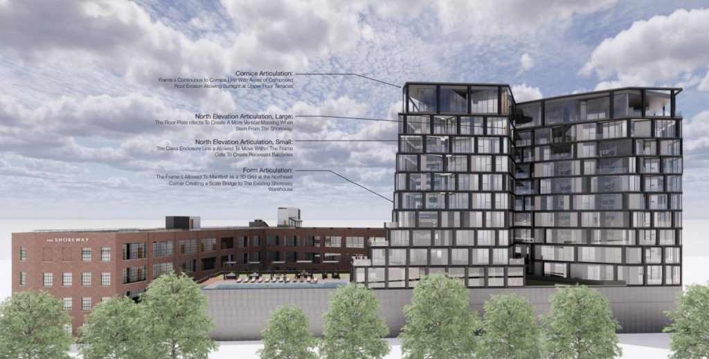
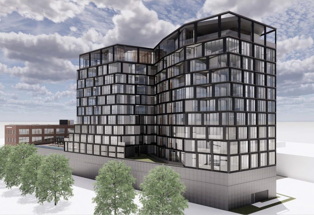
Looking southward at the tower addition to The Shoreway Apartments which features a 10-story residential building over a three-level parking garage. This shows a new indent in what was a sheer façade facing Lake Erie and Edgewater Park. The 10-year-old Shoreway Apartments are at left and behind the addition (EAO).
The Shoreway’s wood-framed parking garage will be demolished and replaced with the new addition. That expansion includes 10 stories of apartments over a three-level, 173-space parking garage topped with a pool and amenity-laden patio. Some of the parking was shifted below the amenity deck and specifically the pool, requiring that it be raised slightly. Neburka said that didn’t change the height of the tower, however.
“Probably the biggest change, which we really saw as a positive change, came through marketing studies and analysis of the internal units the viability of those units,” he added. “We changed the floor plate shape … so that the north face of the building … actually became more sculpted to allow for a thinner profile floorplate coming around.”
That resulted in an indent into the north side of the building, facing the lake, resulting in smaller apartments, more terraces and more windows, making the units more marketable. Neburka also made the building’s grid-like exterior more glassy and distorted the frame so that it looks like the building is twisted.
“The approach to the project is matching the Shoreway’s utilitarian grid,” he said. “It’s a very unadorned brick industrial structure. We looked to how can we match and be sympathetic to that façade approach but also bring a little more life into that. The initial proposal and the current proposal in front of you has always maintained an idea of using that grid and utilitarian façade in a more sculptural way.”
“What we did is, moving from the left, we’ve allowed that grid to begin to expand and distort as it comes around to the lake side and really open up to those views and recompose itself as it comes back around to the south,” Neburka explained. “Keeping a very simple orthogonal (involving right angles) floor plate on those three sides we’ve allowed the building to have a more sculptural presentation.”
That design approach also won for it more praise from Landmarks Commission members who suggested a minor design change to the east wall next to the amenity deck and an analysis of the glassy lakeside building with regard to limiting bird strikes.
Chairperson Julie Trott said the building looks like two structures from the north side, facing Lake Erie and Edgewater Park. “I personally do like that being a softer interaction from that direction,” she said.
“I think this is a fantastic project,” said Vice Chair Robert Strickland. “I thought it was when it was originally proposed. This certainly enhanced it. It looks like Frank Gehry was a design consultant,” he joked, eliciting a smile from Neburka.
Even commission member Michele Anderson, who voted against the project last time, voted in support of it this time. She called the revised design “definitely an improvement” and praised a revision to the design of the top of the tower which she said looked “unfinished.”
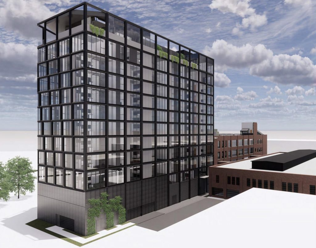
The south side of the Shoreway tower shows a simple grid that begins to distort and become sculpted as it goes around the west side of the building. In a prior design approved by the Landmarks Commission, the top of the tower had vertical beams that terminated without connecting to any horizontal structures. Some said it looked “unfinished.” Those beams are now connected in the new design (EAO).
“One of the elements that I know probably caused more conversation through both the neighborhood and the commission’s review of the project was the composure and the termination of the grid at the top of the building,” Neburka said. “We did come back and decide that, OK I think we’ll compose the top of this a little bit more.”
The tower is to be built on the vacated West 78th Street right of way. Below it was a sewer that fed into an interceptor below the railroad tracks. While the street was abandoned, the sewer wasn’t. It still served the neighborhood to the south but wasn’t shown on any maps or charts.
So the sewer had to be relocated to the west by J Roc which had previously planned the Shoreway addition as a 73-unit building. That 10-story structure was expanded to 13 floors and 95 units to produce more revenue so the sewer relocation could be afforded, said Adam Comer, J Roc’s development manager.
Some developers have slowed or stopped developing at this time of high construction costs and interest rates. Not J Roc. In addition to the Shoreway tower, J Roc is actively pursuing a large development of a downtown-facing hillside at the north end of Tremont. And construction is nearing completion at the Driftwood Apartments at West 11th Street and Fairfield Avenue, also in Tremont.
END

